CASE STUDY · MOBILE BANKING · UX
FransiMobile Redesign
Rebuilding the onboarding experience for a mobile banking app, so new users can open an account without friction, confusion, or drop-off.
Role
UX research, onboarding flow design, wireframing, and UI redesign for the FransiMobile app.
Process
Interviewed current users, built personas, ran a competitive audit against rival banking apps, then mapped, wireframed, and designed a simplified onboarding flow.
Outcome
A clearer, faster sign-up journey — fewer steps, less friction, and an interface built around what users actually needed to get started.
Hero visual slot for homepage, brand system, and final website screenshots.
Case details
Bank Saudi Fransi's mobile app, redesigned to solve a specific problem: users were struggling during registration, and the app's App Store ratings lagged behind competitors as a result.
Users were getting stuck before they even reached the dashboard.
ransiMobile's onboarding process was the biggest barrier between new users and the app. Registration felt disjointed, steps weren't clearly signposted, and the friction showed up directly in App Store reviews — FransiMobile consistently rated lower than competing banking apps.
I started with two questions: what do users need most to get through onboarding, and what are competitors doing better? To answer them, I interviewed current FransiMobile users, built personas around their goals and pain points, and ran a competitive audit against other banking apps. The audit surfaced a consistent pattern — competitors offered easier onboarding, fewer interactions per step, and cleaner, more minimal interfaces, while FransiMobile asked for too much, too fast, in a cluttered layout.
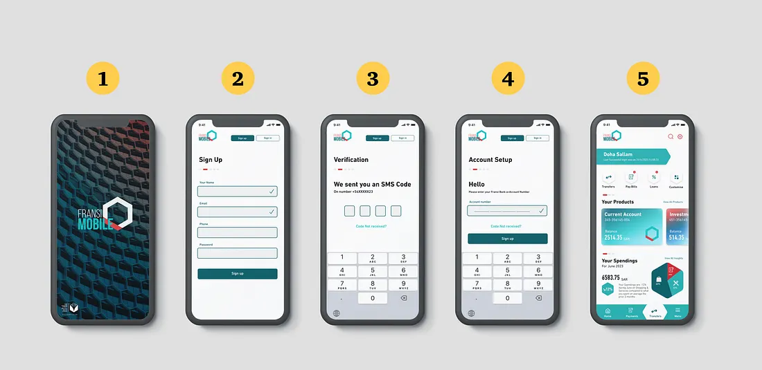
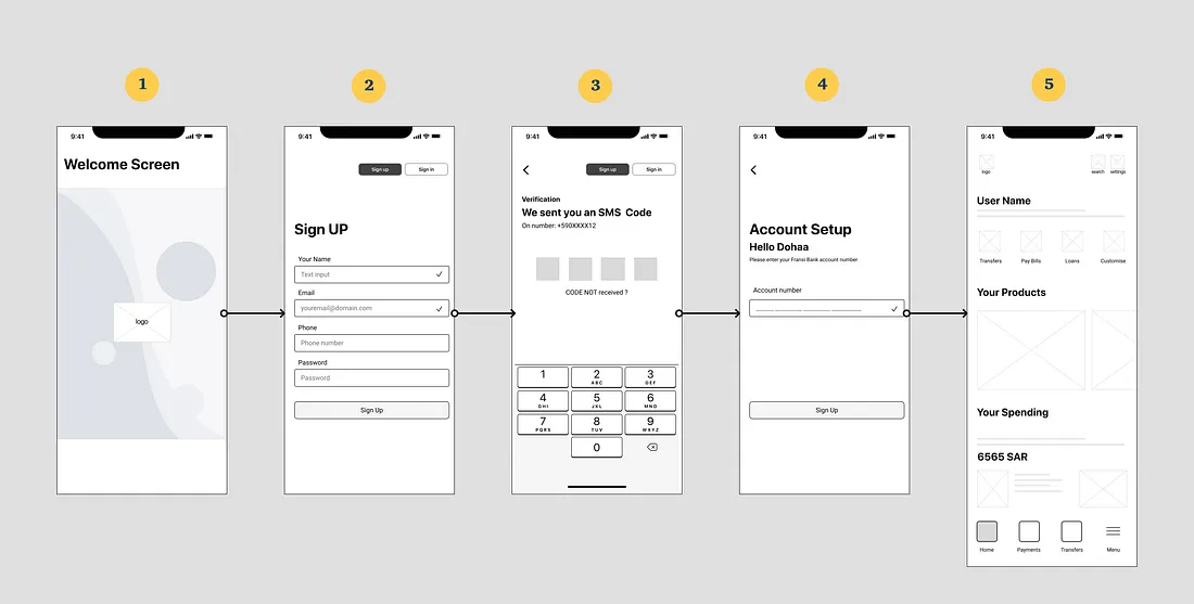
From there, I mapped the ideal onboarding flow — welcome screen, sign-up, identity verification, account setup, dashboard — wireframed each step, and designed a hi-fi UI that carried that simplicity through to the finished product.
The Challenge
Wireframes for the five-step onboarding flow: welcome, sign-up, verification, account setup, and dashboard.
Process photo
insight
Users didn't mind extra steps — they minded feeling unsure what a step was for.
Ready for outcomes
What the redesign changed
01
A five-step onboarding flow replaced a dense, unclear sign-up process — each screen with a single, obvious purpose.
02
Competitive audit findings (simplicity, fewer interactions, minimal UI) directly shaped the redesigned interface.
03
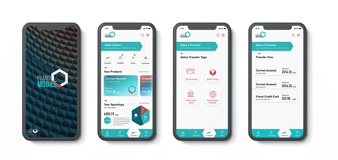
Before/after UI comparison shows the shift from a cluttered current-state design to a minimal, guided redesign.